Coordinate systems are a key component of charts. With a coordinate system, the position, length measurement, and direction measurement of each point and basic graphic element in the chart can be determined. A coordinate system is a fundamental reference frame. Using Excel’s chart coordinate system-related objects, properties, and methods, we can configure coordinate systems to achieve desired graphical effects.
Axes Object and Axis Object
In Excel, an Axis object represents a single axis, and its plural form (Axes) represents multiple axes and their coordinate system. A 2D plane coordinate system has two axes (horizontal and vertical), while a 3D space coordinate system has three axes.
The syntax to get an Axis object via the Chart object using APIs is:
axs = cht.Axes(Type, AxisGroup)Where:
cht: A Chart object.
Type: Required. Values: 1, 2, or 3.
1: The axis displays categories (commonly used for the horizontal axis).
2: The axis displays values (commonly used for the vertical axis).
3: The axis displays data series (only for 3D charts).
AxisGroup: Optional. Specifies primary/secondary axes.
2: Secondary axis.
1: Primary axis.
First, select the data, use the AddChart2 method of the Shapes object to create a Shape object representing the chart, then get the Chart object via its Chart property.
[Excel VBA]
Sample file path: Samples\ch18\Excel VBA\CoordinateSystem.xlsm.
Sub Test()
    Dim cht As Chart
    ActiveSheet.Range("A1:B7").Select
    Set cht = ActiveSheet.Shapes.AddChart2(-1, xlColumnClustered, _
        200, 20, 300, 200, True).Chart
End Sub
Running this procedure generates the chart in Figure 6-9.
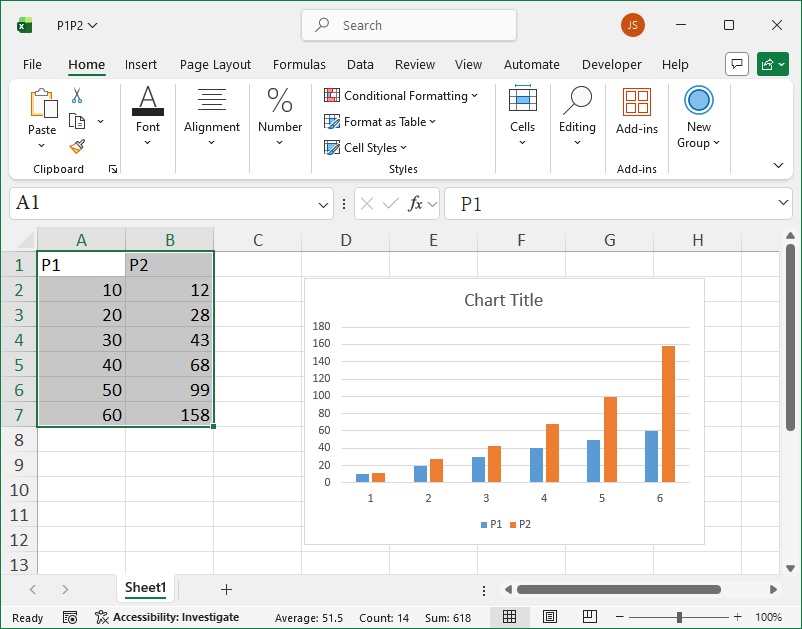
Figure 6-9
[Python xlwings API]
Python script path: Samples\ch18\Python\CreateChart_CoordinateSystem.py.
import xlwings as xw   # Import xlwings package
import os             # Import os package
root = os.getcwd()    # Get current path
app = xw.App(visible=True, add_book=False)  # Create Excel app(no workbook)
wb = app.books.open(root + r'/P1P2.xlsx', read_only=False)  # Open file(writable)
sht = wb.sheets(1)    # Get worksheet
sht.api.Range('A1:B7').Select()  # Select data
# Create chart
cht = sht.api.Shapes.AddChart2(-1, xw.constants.ChartType.xlColumnClustered, _
    200, 20, 300, 200, True).Chart
Running the script generates the chart in Figure 6-9.
We can use the Axes property of the Chart object to get the horizontal and vertical axes and configure their properties. The Border property allows us to set the axis’s color, line style, and line weight.
Below, we create a chart and set the Border property of both axes, and enable minor gridlines by setting HasMinorGridlines to True.
[Excel VBA]
Sample file path: Samples\ch18\Excel VBA\CoordinateSystem.xlsm.
Sub Test2()
    Dim cht As Chart
    Dim axs As Axis
    ActiveSheet.Range("A1:B7").Select       'Data
    Set cht = ActiveSheet.Shapes.AddChart.Chart  'Add chart
    Set axs = cht.Axes(1)                    'Horizontal axis
    axs.Border.ColorIndex = 3                'Red
    axs.Border.Weight = 3                    'Line weight
    axs.HasMinorGridlines = True             'Display minor gridlines
    Set axs2 = cht.Axes(2)                   'Vertical axis
    axs2.Border.Color = RGB(0, 0, 255)       'Blue
    axs2.Border.Weight = 3                    'Line weight
    axs2.HasMinorGridlines = True             'Display minor gridlines
End Sub
Running this procedure generates the chart in Figure 6-10.
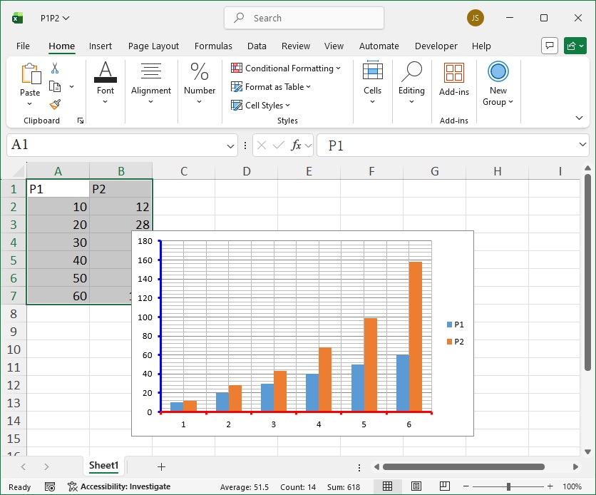
Figure 6-10
[Python xlwings API]
Python script path: Samples\ch18\Python\SetAxes.py.
Previous code omitted; refer to the Python file.
sht.api.Range('A1:B7').Select()       # Data
cht = sht.api.Shapes.AddChart().Chart  # Add chart
axs = cht.Axes(1)                      # Horizontal axis
axs.Border.ColorIndex = 3              # Red
axs.Border.Weight = 3                  # Line weight
axs.HasMinorGridlines = True           # Display minor gridlines
axs2 = cht.Axes(2)                     # Vertical axis
axs2.Border.Color = xw.utils.rgb_to_int((0, 0, 255))  # Blue
axs2.Border.Weight = 3                  # Line weight
axs2.HasMinorGridlines = True           # Display minor gridlines
The running effect is shown in Figure 6-10.
Axis Titles
We can use the HasTitle property of the Axis object to control whether to display an axis title, and the AxisTitle property to set the title text. Note: The AxisTitle property can only be configured after setting HasTitle to True. The AxisTitle property returns an AxisTitle object, which allows us to set the title text and font.
Continuing from the drawing code in Section 6.3.1, we add titles to both axes: the horizontal axis title is red and italic; the vertical axis title is bold.
[Excel VBA]
Sample file path: Samples\ch18\Excel VBA\CoordinateSystem.xlsm.
Sub Test3()
    Dim cht As Chart
    Dim axs As Axis
    ActiveSheet.Range("A1:B7").Select       'Data
    Set cht = ActiveSheet.Shapes.AddChart.Chart  'Add chart
    Set axs = cht.Axes(1)                    'Horizontal axis
    Set axs2 = cht.Axes(2)                   'Vertical axis
    axs.HasTitle = True                      'Horizontal axis has title
    axs.AxisTitle.Caption = "Horizontal Axis Title"  'Title text
    axs.AxisTitle.Font.Italic = True         'Italic font
    axs.AxisTitle.Font.Color = RGB(255, 0, 0) 'Red text
    axs2.HasTitle = True                     'Vertical axis has title
    axs2.AxisTitle.Caption = "Vertical Axis Title"    'Title text
    axs2.AxisTitle.Font.Bold = True          'Bold font
End Sub
Running this procedure generates the chart in Figure 6-11.
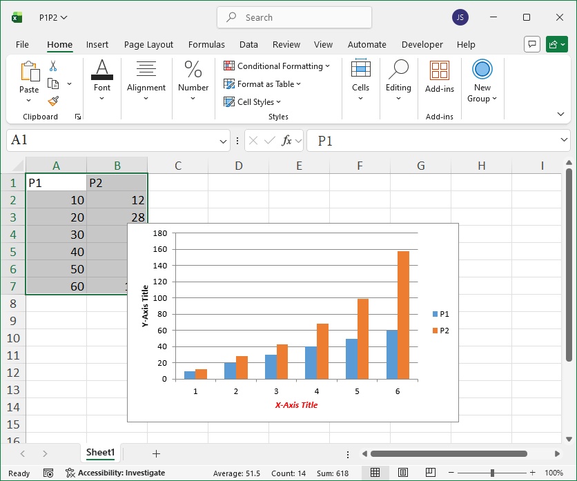
Figure 6-11
[Python xlwings API]
Python script path: Samples\ch18\Python\SetAxisTitles.py.
Previous code omitted; refer to the Python file.
axs.HasTitle = True                                          # Horizontal axis has title
axs.AxisTitle.Caption = 'Horizontal Axis Title'              # Title text
axs.AxisTitle.Font.Italic = True                             # Italic font
axs.AxisTitle.Font.Color = xw.utils.rgb_to_int((255, 0, 0))  # Red text
axs2.HasTitle = True                                         # Vertical axis has title
axs2.AxisTitle.Caption = 'Vertical Axis Title'                # Title text
axs2.AxisTitle.Font.Bold = True                              # Bold font
Running the script generates the chart in Figure 6-11.
Value Axis Range
The vertical axis is the value axis. We can use the MinimumScale and MaximumScale properties of the vertical axis object to set the minimum and maximum values of the value axis.
Below, we set the minimum and maximum values of the vertical axis to 10 and 200, respectively.
[Excel VBA]
Sample file path: Samples\ch18\Excel VBA\CoordinateSystem.xlsm.
Sub Test4()
    'Omit previous code; refer to the sample file
    '......
    axs2.MinimumScale = 10
    axs2.MaximumScale = 200
End Sub
Running this procedure adjusts the vertical axis range, and the chart display updates accordingly (see Figure 6-12).
[Python xlwings API]
Python script path: Samples\ch18\Python\SetValueAxisRange.py.
Previous code omitted; refer to the Python file.
axs2.MinimumScale = 10
axs2.MaximumScale = 200
Running the script produces the effect in Figure 6-12.
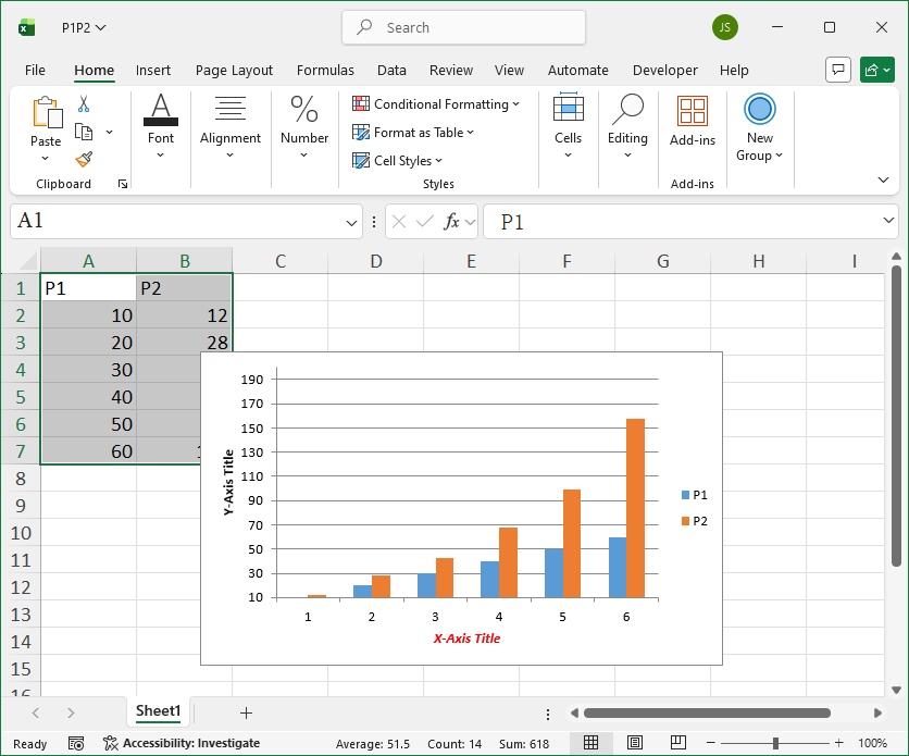
Figure 6-12
Tick Marks
Tick marks are short lines on the axis that help determine the position of points in the chart. There are major and minor tick marks. We can use the MajorTickMark and MinorTickMark properties of the Axis object to set major and minor tick marks.
Values for MajorTickMark and MinorTickMark are listed in Table 6-5.
Table 6-5: Values of MajorTickMark and MinorTickMark
| Name | Value | Description |
|---|---|---|
| xlTickMarkCross | 4 | Cross the axis. |
| xlTickMarkInside | 2 | Inside the axis. |
| xlTickMarkNone | -4142 | No tick marks. |
| xlTickMarkOutside | 3 | Outside the axis. |
The following code sets the horizontal axis’s major tick marks to cross the axis and minor tick marks to inside the axis.
[Excel VBA]
Sample file path: Samples\ch18\Excel VBA\CoordinateSystem.xlsm.
Sub Test5()
    'Omit previous code; refer to the sample file
    '......
    axs.MajorTickMark = 4
    axs.MinorTickMark = 2
End Sub
[Python xlwings API]
Python script path: Samples\ch18\Python\SetTickMarks.py.
Previous code omitted; refer to the Python file.
axs.MajorTickMark = 4
axs.MinorTickMark = 2
The TickMarkSpacing property returns or sets the number of data points between major tick marks (only for category and series axes; value: 1–31,999).
The MajorUnit and MinorUnit properties set the major and minor unit intervals for the value axis.
For example: Set the value axis to display a major tick mark every 40 units (starting from the minimum value) and minor tick marks every 10 units.
If MajorUnitIsAuto or MinorUnitIsAuto is set to True, Excel automatically calculates the major/minor unit intervals. When MajorUnit or MinorUnit is set, the corresponding IsAuto property is automatically set to False.
Tick Labels
Tick labels are text labels on the axis corresponding to major tick marks, which annotate the values or categories of the major tick marks.
Category axis: Tick label text is the name of the associated category. By default, category axis labels are numbered from 1 (left to right). The TickLabelSpacing property sets the number of categories between tick labels.
Value axis: Tick label text corresponds to the MajorUnit, MinimumScale, and MaximumScale properties of the value axis. To change value axis label text, modify these properties.
The TickLabels property of the Axis object returns a TickLabels object, which represents the axis’s tick labels. We can use its properties/methods to configure the font, number format, orientation, offset, and alignment of the labels.
Below, we set the number format, font, and orientation of the value axis’s tick labels.
[Excel VBA]
Sample file path: Samples\ch18\Excel VBA\CoordinateSystem.xlsm.
Sub Test6()
    'Omit previous code; refer to the sample file
    '......
    Set tl = axs2.TickLabels                 'Vertical axis tick labels
    tl.NumberFormat = "0.00"                 'Number format(two decimal places)
    tl.Font.Italic = True                    'Italic font
    tl.Font.Name = "Times New Roman"         'Font name
    tl.Orientation = 45                      '45° orientation
End Sub
Running this procedure generates the chart in Figure 6-13.
Figure 6-13
[Python xlwings API]
Python script path: Samples\ch18\Python\SetTickLabels.py.
Previous code omitted; refer to the Python file.
tl = axs2.TickLabels                       # Vertical axis tick labels
tl.NumberFormat = '0.00'                   # Number format(two decimal places)
tl.Font.Italic = True                      # Italic font
tl.Font.Name = 'Times New Roman'           # Font name
tl.Orientation = 45                        # 45° orientation
Running the script generates the chart in Figure 6-13.
In the above code, the Orientation property of the TickLabels object specifies the text direction of the labels (range: -90° to 90°)—useful for long labels.
The TickLabelPosition property specifies the position of tick labels on the axis. Values are listed in Table 6-6.
Table 6-6: Values of TickLabelPosition
| Name | Value | Description |
|---|---|---|
| xlTickLabelPositionHigh | -4127 | Top(for horizontal axes) or right(for vertical axes). |
| xlTickLabelPositionLow | -4134 | Bottom(for horizontal axes) or left(for vertical axes). |
| xlTickLabelPositionNextToAxis | 4 | Next to the axis (when the axis is not on the chart edge). |
| xlTickLabelPositionNone | -4142 | No tick labels. |
The TickLabelSpacing property returns/sets the number of categories or series between tick labels (only for category/series axes; value: 1–31,999). Setting TickLabelSpacingIsAuto to True enables automatic spacing.