Using the methods in Sections 6.1.1–6.1.3, you obtain Chart objects. For composite charts, each simple shape group is called a series, represented by a Series object. You can set properties such as chart type, bar color, line style, markers, and data labels for each series.
For special charts (line, scatter, radar), you can set individual control points.
Setting Chart Type
The chart_type attribute of the Chart object or the ChartType property of the Chart object can be used to set the type of a chart. For a chart object cht, the chart type can be set in the following ways.
【Excel VBA】
cht.ChartType = xlColumnClustered【Python xlwings】
>>> cht.chart_type = 'column_clustered'【Python xlwings API】
>>> cht.ChartType = xw.constants.ChartType.xlColumnClusteredThe values of the chart_type attribute or ChartType property are shown in Table 6-1. The third column of Table 6-1 represents the string value of the chart type as the value for the chart_type attribute in the xlwings way, while the constants or values in the first two columns are used as the values for the ChartType property in the Excel VBA and API ways. Values can be written directly; the constant form is similar to xw.constants.ChartType.xlLine.
Table 6-1 Excel Chart Types
| Excel VBA and API Constants | Constant Value | xlwings Value | Description |
|---|---|---|---|
| xl3DArea | -4098 | "3d_area" | 3D Area Chart |
| xl3DAreaStacked | 78 | "3d_area_stacked" | 3D Stacked Area Chart |
| xl3DAreaStacked100 | 79 | "3d_area_stacked_100" | 3D 100% Stacked Area Chart |
| xl3DBarClustered | 60 | "3d_bar_clustered" | 3D Clustered Bar Chart |
| xl3DBarStacked | 61 | "3d_bar_stacked" | 3D Stacked Bar Chart |
| xl3DBarStacked100 | 62 | "3d_bar_stacked_100" | 3D 100% Stacked Bar Chart |
| xl3DColumn | -4100 | "3d_column" | 3D Column Chart |
| xl3DColumnClustered | 54 | "3d_column_clustered" | 3D Clustered Column Chart |
| xl3DColumnStacked | 55 | "3d_column_stacked" | 3D Stacked Column Chart |
| xl3DColumnStacked100 | 56 | "3d_column_stacked_100" | 3D 100% Stacked Column Chart |
| xl3DLine | -4101 | "3d_line" | 3D Line Chart |
| xl3DPie | -4102 | "3d_pie" | 3D Pie Chart |
| xl3DPieExploded | 70 | "3d_pie_exploded" | Exploded 3D Pie Chart |
| xlArea | 1 | "area" | Area Chart |
| xlAreaStacked | 76 | "area_stacked" | Stacked Area Chart |
| xlAreaStacked100 | 77 | "area_stacked_100" | 100% Stacked Area Chart |
| xlBarClustered | 57 | "bar_clustered" | Clustered Bar Chart |
| xlBarOfPie | 71 | "bar_of_pie" | Bar-of-Pie Chart |
| xlBarStacked | 58 | "bar_stacked" | Stacked Bar Chart |
| xlBarStacked100 | 59 | "bar_stacked_100" | 100% Stacked Bar Chart |
| xlBubble | — | "bubble" | Bubble Chart |
| xlBubble3DEffect | 87 | "bubble_3d_effect" | 3D Effect Bubble Chart |
| xlColumnClustered | 51 | "column_clustered" | Clustered Column Chart |
| xlColumnStacked | 52 | "column_stacked" | Stacked Column Chart |
| xlColumnStacked100 | 53 | "column_stacked_100" | 100% Stacked Column Chart |
| xlConeBarClustered | 102 | "cone_bar_clustered" | Clustered Cone Bar Chart |
| xlConeBarStacked | 103 | "cone_bar_stacked" | Stacked Cone Bar Chart |
| xlConeBarStacked100 | 104 | "cone_bar_stacked_100" | 100% Stacked Cone Bar Chart |
| xlConeCol | 105 | "cone_col" | 3D Cone Column Chart |
| xlConeColClustered | 99 | "cone_col_clustered" | Clustered Cone Column Chart |
| xlConeColStacked | 100 | "cone_col_stacked" | Stacked Cone Column Chart |
| xlConeColStacked100 | 101 | "cone_col_stacked_100" | 100% Stacked Cone Column Chart |
| xlCylinderBarClustered | 95 | "cylinder_bar_clustered" | Clustered Cylinder Bar Chart |
| xlCylinderBarStacked | 96 | "cylinder_bar_stacked" | Stacked Cylinder Bar Chart |
| xlCylinderBarStacked100 | 97 | "cylinder_bar_stacked_100" | 100% Stacked Cylinder Bar Chart |
| xlCylinderCol | 98 | "cylinder_col" | 3D Cylinder Column Chart |
| xlCylinderColClustered | 92 | "cylinder_col_clustered" | Clustered Cylinder Column Chart |
| xlCylinderColStacked | 93 | "cylinder_col_stacked" | Stacked Cylinder Column Chart |
| xlCylinderColStacked100 | 94 | "cylinder_col_stacked_100" | 100% Stacked Cylinder Column Chart |
| xlDoughnut | -4120 | "doughnut" | Doughnut Chart |
| xlDoughnutExploded | 80 | "doughnut_exploded" | Exploded Doughnut Chart |
| xlLine | 4 | "line" | Line Chart |
| xlLineMarkers | 65 | "line_markers" | Line Chart with Markers |
| xlLineMarkersStacked | 66 | "line_markers_stacked" | Stacked Line Chart with Markers |
| xlLineMarkersStacked100 | 67 | "line_markers_stacked_100" | 100% Stacked Line Chart with Markers |
| xlLineStacked | 63 | "line_stacked" | Stacked Line Chart |
| xlLineStacked100 | 64 | "line_stacked_100" | 100% Stacked Line Chart |
| xlPie | 5 | "pie" | Pie Chart |
| xlPieExploded | 69 | "pie_exploded" | Exploded Pie Chart |
| xlPieOfPie | 68 | "pie_of_pie" | Pie-of-Pie Chart |
| xlPyramidBarClustered | 109 | "pyramid_bar_clustered" | Clustered Pyramid Bar Chart |
| xlPyramidBarStacked | 110 | "pyramid_bar_stacked" | Stacked Pyramid Bar Chart |
| xlPyramidBarStacked100 | 111 | "pyramid_bar_stacked_100" | 100% Stacked Pyramid Bar Chart |
| xlPyramidCol | 112 | "pyramid_col" | 3D Pyramid Column Chart |
| xlPyramidColClustered | 106 | "pyramid_col_clustered" | Clustered Pyramid Column Chart |
| xlPyramidColStacked | 107 | "pyramid_col_stacked" | Stacked Pyramid Column Chart |
| xlPyramidColStacked100 | 108 | "pyramid_col_stacked_100" | 100% Stacked Pyramid Column Chart |
| xlRadar | -4151 | "radar" | Radar Chart |
| xlRadarFilled | 82 | "radar_filled" | Filled Radar Chart |
| xlRadarMarkers | 81 | "radar_markers" | Radar Chart with Markers |
| xlRegionMap | 140 | — | Map |
| xlStockHLC | 88 | "stock_hlc" | High-Low-Close Stock Chart |
| xlStockOHLC | 89 | "stock_ohlc" | Open-High-Low-Close Stock Chart |
| xlStockVHLC | 90 | "stock_vhlc" | Volume-High-Low-Close Stock Chart |
| xlStockVOHLC | 91 | "stock_vohlc" | Volume-Open-High-Low-Close Stock Chart |
| xlSurface | 83 | "surface" | 3D Surface Chart |
| xlSurfaceTopView | 85 | "surface_top_view" | Surface Chart (Top View) |
| xlSurfaceTopViewWireframe | 86 | "surface_top_view_wireframe" | Surface Chart (Top Wireframe View) |
| xlSurfaceWireframe | 84 | "surface_wireframe" | 3D Surface Chart (Wireframe) |
| xlXYScatter | -4169 | "xy_scatter" | Scatter Chart |
| xlXYScatterLines | 74 | "xy_scatter_lines" | Scatter Chart with Lines |
| xlXYScatterLinesNoMarkers | 75 | "xy_scatter_lines_no_markers" | Scatter Chart with Lines (No Markers) |
| xlXYScatterSmooth | 72 | "xy_scatter_smooth" | Scatter Chart with Smooth Lines |
| xlXYScatterSmoothNoMarkers | 73 | "xy_scatter_smooth_no_markers" | Scatter Chart with Smooth Lines (No Markers) |
Next, we will create more types of charts using the AddChart2 method of the Shapes object with the data provided in Section 6.1.
【Excel VBA】
The path of the sample file is Samples\ch18\Excel VBA\Chart Types.xlsm.
Sub CreateCharts()
    ActiveSheet.Range("A1").CurrentRegion.Select  ' Data
    ActiveSheet.Shapes.AddChart2 -1, xlColumnClustered, _
        20, 150, 300, 200, True
    ActiveSheet.Shapes.AddChart2 -1, xlBarClustered, _
        400, 150, 300, 200, True
    ActiveSheet.Shapes.AddChart2 -1, xlConeBarStacked, _
        20, 400, 300, 200, True
    ActiveSheet.Shapes.AddChart2 -1, xlLineMarkersStacked, _
        400, 400, 300, 200, True
    ActiveSheet.Shapes.AddChart2 -1, xlXYScatter, _
        20, 650, 300, 200, True
    ActiveSheet.Shapes.AddChart2 -1, xlPieOfPie, _
        400, 650, 300, 200, True
End Sub
Run the procedure to generate different types of charts as shown in Figure 6-5.
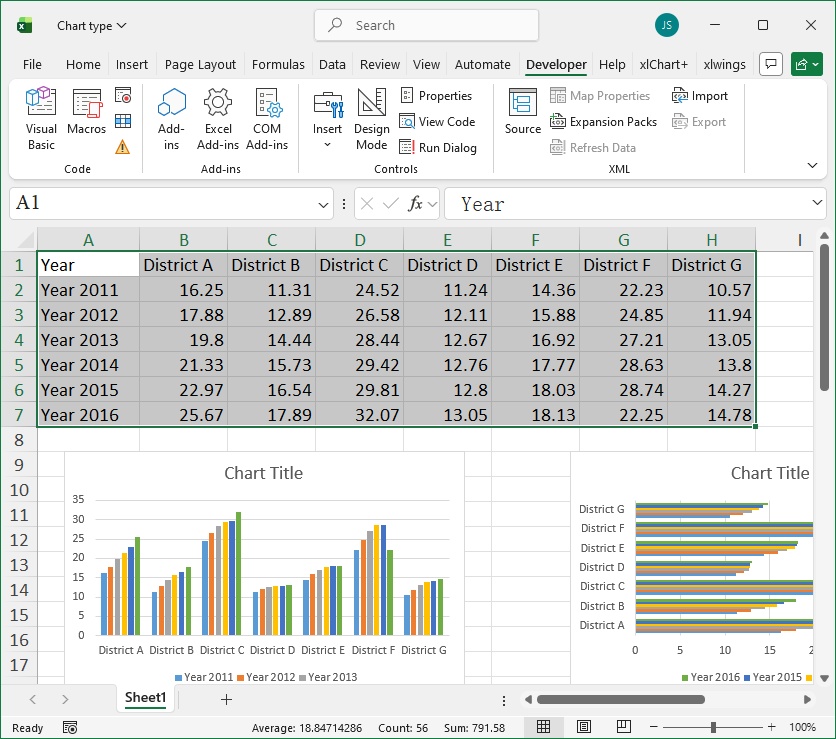
Figure 6-5
【Python xlwings API】
The path of the Python script file is Samples\ch18\Python\Chart Types.py.
(The preceding code is omitted; please refer to the Python file.)
... ...
sht.api.Range('A1').CurrentRegion.Select()  # Data
sht.api.Shapes.AddChart2(-1, xw.constants.ChartType.xlColumnClustered, \
    20, 150, 300, 200, True)
sht.api.Shapes.AddChart2(-1, xw.constants.ChartType.xlBarClustered, \
    400, 150, 300, 200, True)
sht.api.Shapes.AddChart2(-1, xw.constants.ChartType.xlConeBarStacked, \
    20, 400, 300, 200, True)
sht.api.Shapes.AddChart2(-1, xw.constants.ChartType.xlLineMarkersStacked, \
    400, 400, 300, 200, True)
sht.api.Shapes.AddChart2(-1, xw.constants.ChartType.xlXYScatter, \
    20, 650, 300, 200, True)
sht.api.Shapes.AddChart2(-1, xw.constants.ChartType.xlPieOfPie, \
    400, 650, 300, 200, True)
Run the script to generate different types of charts as shown in Figure 6-5.
Common Properties and Methods of Chart Object
The type of a chart is set using the ChartType property of the Chart object. In fact, the Chart object has many other properties and methods that can be used to configure the chart in various ways. The commonly used properties of the Chart object are listed in Table 6-2, which will be introduced gradually later.
Table 6-2: Commonly Used Properties of the Chart Object
| Name | Meaning |
|---|---|
| BackWall | Returns a Walls object, which allows users to format the background wall of a three-dimensional chart individually. |
| BarShape | Shape of the bar. |
| ChartArea | Returns a ChartArea object representing the entire chart area of the chart. |
| ChartStyle | Gets or sets the chart style. A number between 1 and 48 can be used to specify the chart style. |
| ChartTitle | Returns a ChartTitle object representing the title of the specified chart. |
| ChartType | Gets or sets the chart type. |
| Copy | Copies the chart sheet to another location within the workbook. |
| CopyPicture | Copies the chart as a picture to the clipboard. |
| DataTable | Returns a DataTable object representing the data table for this chart. |
| Delete | Deletes the chart. |
| Export | Exports the chart as an image file. |
| HasAxis | Gets or sets whether axes are displayed on the chart. |
| HasDataTable | If the chart has a data table, the value of this property is True; otherwise, it is False. |
| HasTitle | Sets whether the title is displayed. |
| Legend | Returns a Legend object representing the legend of the chart. |
| Move | Moves the chart sheet to another location in the workbook. |
| Name | Name of the chart. |
| PlotArea | Returns a PlotArea object representing the plot area of the chart. |
| PlotBy | Gets or sets how rows or columns are used as data series in the chart. Can be one of the following xlRowCol constants: xlColumns or xlRows. |
| SaveAs | Saves the chart as a separate file. |
| Select | Selects the chart. |
| SeriesCollection | Returns a collection containing all the series in the chart. |
| SetElement | Sets chart elements. |
| SetSourceData | Binds the data used to draw the chart. |
| Visible | Gets or sets an xlSheetVisibility value determining whether the object is visible. |
| Walls | Returns a Walls object representing the background walls of a three-dimensional chart. |
Setting Series
Each Chart object has a SeriesCollection property, which returns a collection containing all the series in the chart. So what is a series? For the composite column chart shown in Figure 6-3, each province corresponds to one composite column, and each composite column contains six single columns of different colors. All single columns of the same color across provinces form a series. Therefore, the composite column chart shown in Figure 6-3 has six series in total. A series can be represented by a Series object.
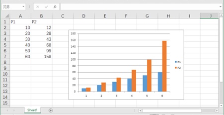
Figure 6-6: Chart Generated by Default
[Excel VBA]
The sample file path is Samples\ch18\Excel VBA\Sequence.xlsm.
Sub Test()
    'Create a chart
    ActiveSheet.Range("A1:B7").Select
    ActiveSheet.Shapes.AddChart
End Sub
Running this procedure generates the chart shown in Figure 6-6.
[Python xlwings API]
The Python script file path is Samples\ch18\Python\SetSeries.py.
Previous code omitted; refer to the Python file.
sht.api.Range("A1:B7").Select()
cht = sht.api.Shapes.AddChart().Chart
Running the script generates the chart shown in Figure 6-6. The first line selects the data for plotting, and the second line uses the AddChart method of the Shapes object to create a Shape object representing the chart. The Chart property of this object returns a Chart object.
We can use the SeriesCollection property of the Chart object to return a collection containing all the series in the chart. Below, we use the Count property to get the number of series in the collection.
[Excel VBA]
Sample file path: Samples\ch18\Excel VBA\Sequence.xlsm.
Sub Test2()
    Dim cht As Chart
    ActiveSheet.Range("A1:B7").Select
    Set cht = ActiveSheet.Shapes.AddChart.Chart
    Debug.Print cht.SeriesCollection.Count
End Sub
Running this procedure outputs the number of series in the chart (i.e., 2) in the Immediate Window.
[Python xlwings API]
Code to get the number of series in the chart using Python xlwings API:
>>> cht.SeriesCollection().Count
2
As shown in Figure 6-6, there are two types of columns (different colors), and each color forms a series—hence two series in total.
We can reference a series by its name or index in the collection. Below, we reference the second series, change its chart type to a line chart using the ChartType property, enable smoothing with the Smooth property, set the marker at each data point to a triangle using MarkerStyle, set the marker color to blue with MarkerForegroundColor, and display data labels by setting HasDataLabel to True.
[Excel VBA]
Sample file path: Samples\ch18\Excel VBA\Sequence.xlsm.
Sub Test3()
    Dim cht As Chart
    Dim ser2 As Series
    ActiveSheet.Range("A1:B7").Select
    Set cht = ActiveSheet.Shapes.AddChart.Chart
    Set ser2 = cht.SeriesCollection("P2")    'Second series
    ser2.ChartType = xlLine                  'Line chart
    ser2.Smooth = True                       'Smoothing
    ser2.MarkerStyle = xlMarkerStyleTriangle 'Marker
    ser2.MarkerForegroundColor = RGB(0, 0, 255) 'Color(blue)
    ser2.HasDataLabels = True                'Display data labels
End Sub
Running this procedure produces the effect shown in Figure 6-7 (after setting the second series).
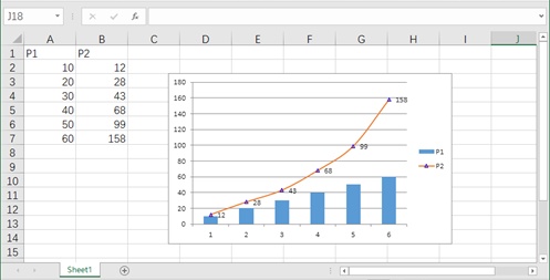
Figure 6-7
[Python xlwings API]
Python script path: Samples\ch18\Python\SetSeries.py.
Previous code omitted; refer to the Python file.
ser2 = cht.SeriesCollection('P2')               #Second series
ser2.ChartType = xw.constants.ChartType.xlLine  #Line chart
ser2.Smooth = True                              #Smoothing
ser2.MarkerStyle = xw.constants.MarkerStyle.xlMarkerStyleTriangle  #Marker
ser2.MarkerForegroundColor = xw.utils.rgb_to_int((0, 0, 255))       #Color(blue)
ser2.HasDataLabels = True                       #Display data labels
Running the script changes the chart to the effect in Figure 6-7. This shows that individual series can be modified by setting properties of the Series object.
Setting Properties of Individual Points in a Series
Using the Points property of the Series object, we can get all data points in the series. We can extract specific points via an index and configure them. An individual point is represented by a Point object, whose properties and methods allow us to customize the specified point. Point settings are mainly used for line charts, scatter plots, radar charts, etc.
Continuing from Section 6.2.3, we first get the number of data points in the second series.
[Excel VBA]
Sample file path: Samples\ch18\Excel VBA\Sequence.xlsm.
Sub Test3()
    'Omit previous code; refer to the sample file
    '......
    Debug.Print ser2.Points.Count
End Sub
Running this procedure outputs the number of data points in the second series (i.e., 6) in the Immediate Window.
[Python xlwings API]
Code to get the number of data points in the second series using Python xlwings API:
>>> ser2.Points().Count
6
Common properties of the Point object are listed in Table 6-3.
Table 6-3: Common Properties of the Point Object
| Name | Meaning |
|---|---|
| DataLabel | Returns a DataLabel object representing the data label. |
| HasDataLabel | Whether to display the data label. |
| MarkerBackgroundColor | Marker background color (RGB coloring). |
| MarkerBackgroundColorIndex | Marker background color (indexed coloring). |
| MarkerForegroundColor | Marker foreground color (RGB coloring). |
| MarkerForegroundColorIndex | Marker foreground color (indexed coloring). |
| MarkerSize | Size of the marker. |
| MarkerStyle | Style of the marker. |
| Name | Name of the point. |
| PictureType | Sets how pictures are displayed in column/bar charts (stretched or stacked). |
The MarkerStyle property of the Point object sets the marker style. Its value is of the xlMarkerStyle enumeration type (see Table 6-4).
Table 6-4: Values of the MarkerStyle Property
| Name | Value | Description |
|---|---|---|
| xlMarkerStyleAutomatic | -4105 | Automatically set markers. |
| xlMarkerStyleCircle | 8 | Circular marker. |
| xlMarkerStyleDash | -4115 | Long bar marker. |
| xlMarkerStyleDiamond | 2 | Diamond-shaped marker. |
| xlMarkerStyleDot | -4118 | Short bar marker. |
| xlMarkerStyleNone | -4142 | No marker. |
| xlMarkerStylePicture | -4147 | Picture marker. |
| xlMarkerStylePlus | 9 | Square marker with a plus sign. |
| xlMarkerStyleSquare | 1 | Square marker. |
| xlMarkerStyleStar | 5 | Square marker with a star. |
| xlMarkerStyleTriangle | 3 | Triangular marker. |
| xlMarkerStyleX | -4168 | Square marker with an X mark. |
Below, we modify the properties of the third point in the line chart representing the second series: set its foreground/background color to blue, marker style to diamond, and marker size to 10 points.
[Excel VBA]
Sample file path: Samples\ch18\Excel VBA\Sequence.xlsm.
Sub Test4()
    Dim cht As Chart
    Dim ser2 As Series
    ActiveSheet.Range("A1:B7").Select
    Set cht = ActiveSheet.Shapes.AddChart.Chart
    Set ser2 = cht.SeriesCollection("P2")       'Second series
    ser2.ChartType = xlLine                     'Line chart
    ser2.Smooth = True                          'Smoothing
    ser2.MarkerStyle = xlMarkerStyleTriangle    'Marker
    ser2.MarkerForegroundColor = RGB(0, 0, 255)'Color(blue)
    ser2.HasDataLabels = True                   'Display data labels
    'Modify the third point
    ser2.Points(3).MarkerForegroundColor = RGB(0, 0, 255)
    ser2.Points(3).MarkerBackgroundColor = RGB(0, 0, 255)
    ser2.Points(3).MarkerStyle = xlMarkerStyleDiamond
    ser2.Points(3).MarkerSize = 10
End Sub
Running this procedure generates the chart in Figure 6-8. After configuration, the third point in the series is highlighted.
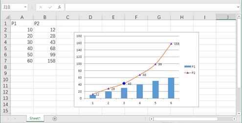
Figure 6-8
[Python xlwings API]
Python script path: Samples\ch18\Python\SetPointInSeries.py.
Previous code omitted; refer to the Python file.
ser2.Points(3).MarkerForegroundColor = xw.utils.rgb_to_int((0, 0, 255))
ser2.Points(3).MarkerBackgroundColor = xw.utils.rgb_to_int((0, 0, 255))
ser2.Points(3).MarkerStyle = xw.constants.MarkerStyle.xlMarkerStyleDiamond
ser2.Points(3).MarkerSize = 10
Running the script produces the final effect in Figure 6-8.